
Overview
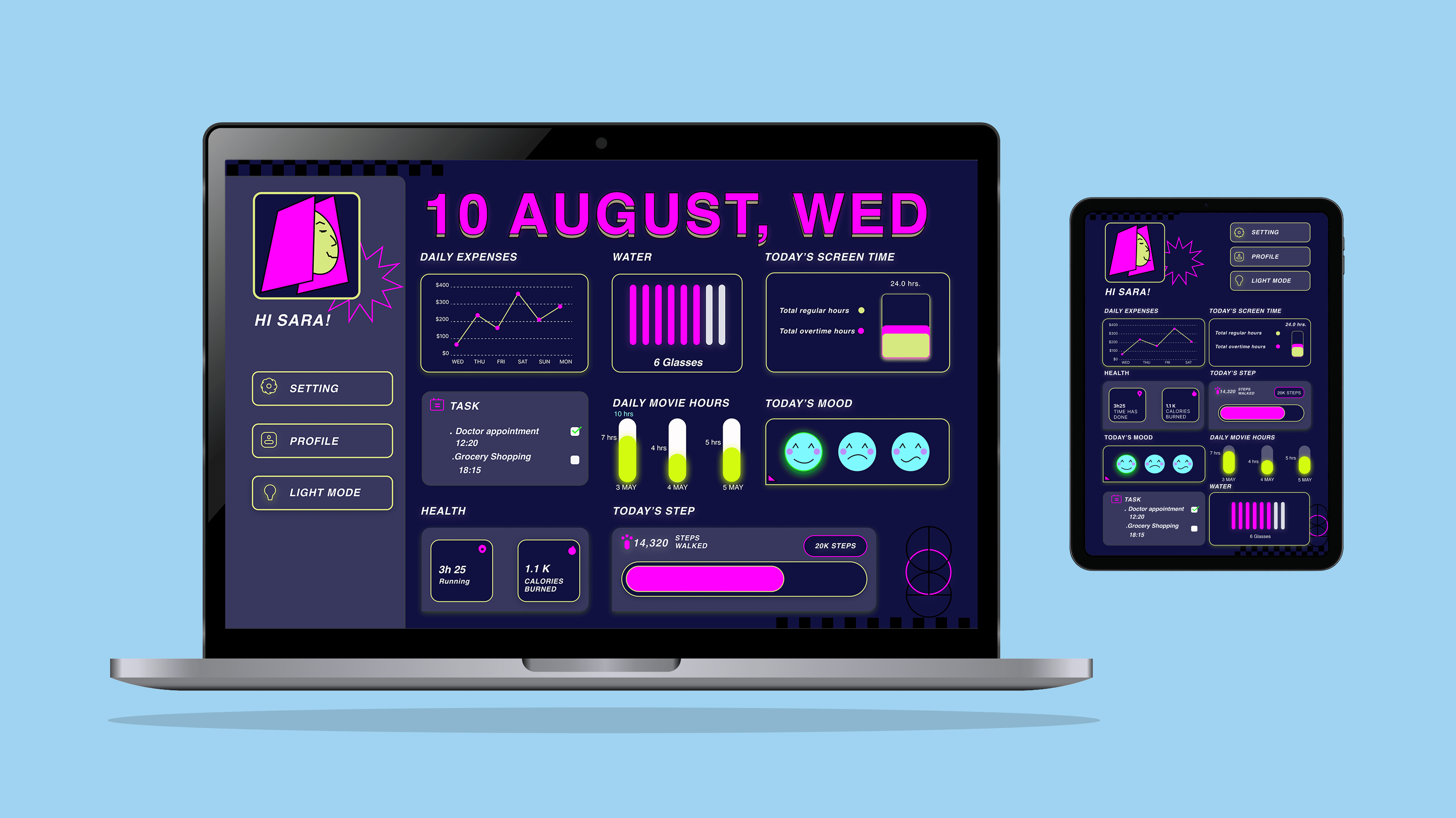
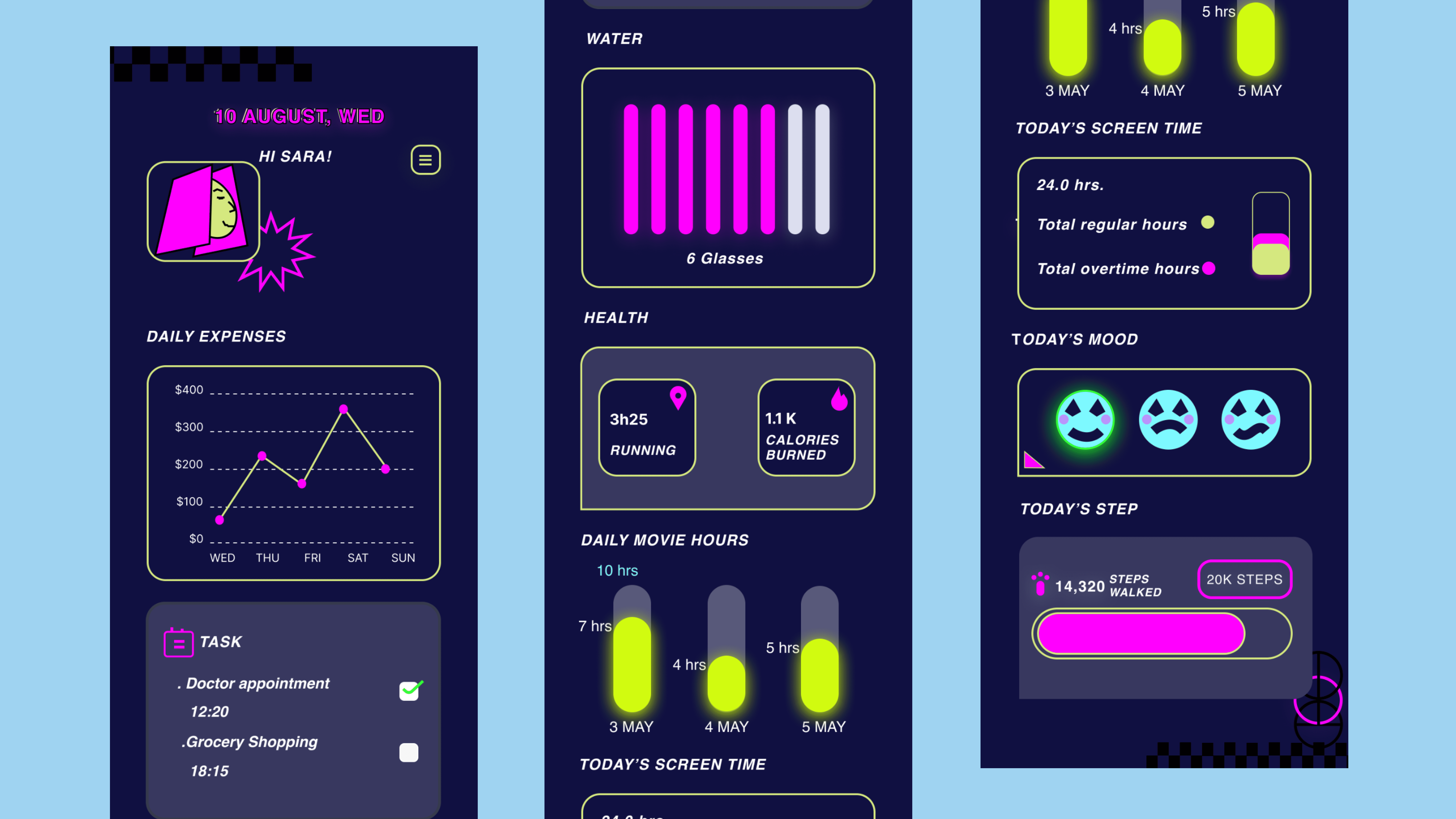
This project explores Neo-Brutalism in UI design, combining dark mode styling with bold typography, neon highlights, and rigid grid structures. The dashboard was designed for desktop, tablet, and mobile to track six key daily human activities in a visually striking way.
Roles
UI Designer
Skills
Visual Design
Project type
Conceptual UI Design
Results
Mid Fidelity
Team
One UI Designer
Activities Tracked
From analysing the dashboard layout, the six activities include:
Daily Expenses : A line chart tracking weekly spending.
Water Intake: A progress tracker for glasses consumed.
Screen Time: Split between regular and overtime hours.
Daily Movie Hours: Logged viewing time across days.
Physical Health: Running time, calories burned, and step count.
Mood Tracking: Emoji-style indicators for daily wellbeing.
Design Approach
The dashboard rejects minimalism and embraces visual energy, oversized date headers, saturated colors, high-contrast elements, and playful iconography.
This approach ensures that even though multiple data points are presented on screen, the layout remains scannable and engaging.
By applying Neo-Brutalist principles, the design aims to balance utility with bold aesthetics that stand out in a market saturated with “safe” minimalist dashboards.
Outcome
The result is a dark mode dashboard that feels both functional and experimental, encouraging users to interact with their data in a way that feels lively rather than clinical. The design adapts well across desktop, tablet, and mobile, keeping consistency in mood and style.
